[ Histogram | Histogram Options | Bins | Plots | Curves | Plot Columns | Heatmap | Pie Chart | Title | Axis Option | Change Axis | Logarithmic | Mark Shape and Size | Mark Color | Grid and Axis | Least Squares Fitting | Zoom, Translate and Center | Plot Selection | Point Label | Print | Save | Table Inline Plots | Mean, Median & IQR | Annotate Plot | Plot R-Groups | Tooltips Balloons ]
| Available in the following product(s): ICM-Chemist | ICM-Chemist-Pro | ICM-VLS |
The data within a table can be plotted graphically. A histogram can be made for the data within one column or a plot can be constructed for the data within two columns.
To make a plot, histogram or heatmap:
- Read in a chemical spreadsheet or other data in spreadsheet form (e.g. csv).
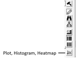
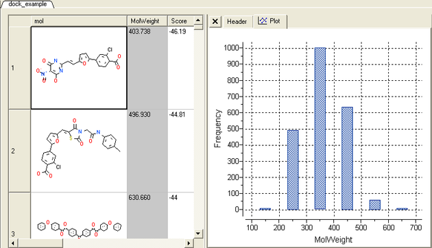
- Click on the plot button at the side of the table (shown below).
To plot a histogram of the data within one column:
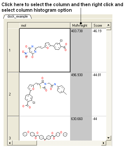
- Select the column by clicking on the column header.
- Right click on the column header.
- Select the Column histogram option.
A plot will then be displayed next to the table.
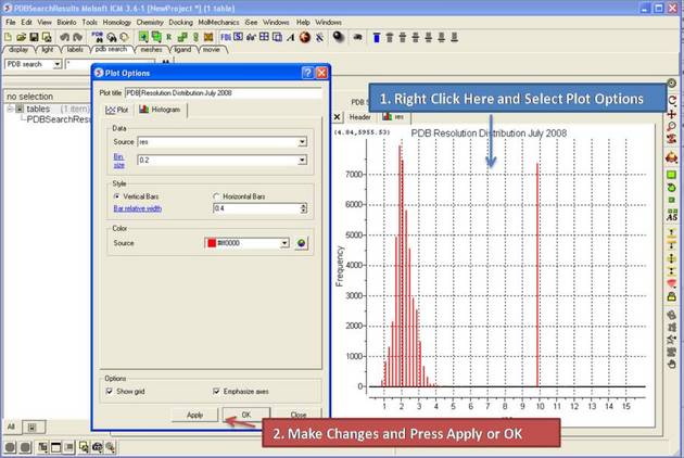
Once you have created a histogram you can change the following parameters by right clicking on the plot and selecting options
Options:
- Change plot title.
- Change the data source using the drop down button and select another column in the table.
- Change the histogram bin size.
- Change the bars positioning from vertical to horizontal.
- Change the bar relative width compared to bin size. Bigger values give thicker bars.
- Color the bars
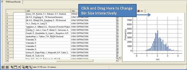
There are two ways to change the bin size. 1. Using the options dialog box or 2. interactively by left clicking and dragging at the top of the plot as shown below - this will allow you to find the best density estimation picture.
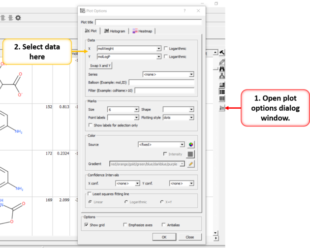
To construct a scatter plot from data within two columns:
- Click on the plot options button (right hand side of table).
- Select the data from the drop down options in the Data section of the dialog box. There are additional options to change the color, mark shape or size, and grid and axis display.
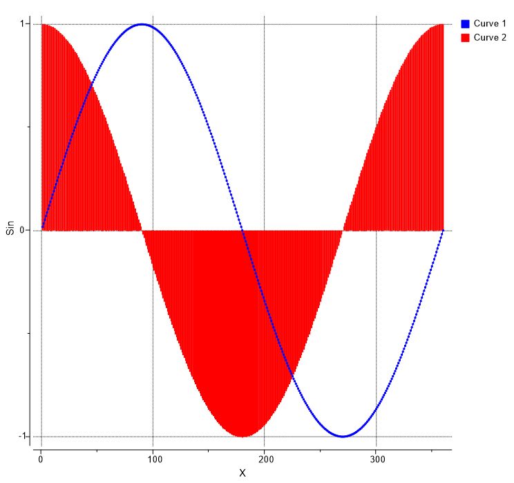
Multiple curves can be added to a plot:
- Make a plot of the first curve.
- Right click on the plot and choose Options.
- Select the "+" button next to Curve data entry box.
- Enter new X and Y data for the second Curve.
- Shading as shown in the image below (red shading) can be achieved by selecting Plotting Style
>Vertical bars.
- Click on the plot options button (right hand side of table).
- Click on the Plot Columns tab at the top of the dialog.
- Select the columns you wish to plot data for.
- Choose Log or Statistics option
- Choose color and plotting style e.g. vertical bars dots...
- Click OK
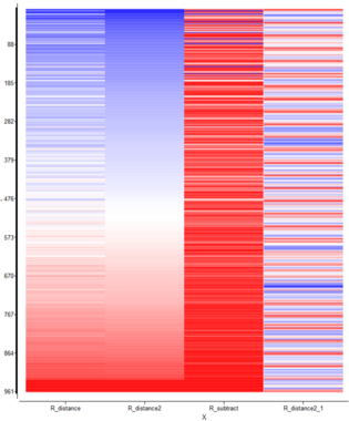
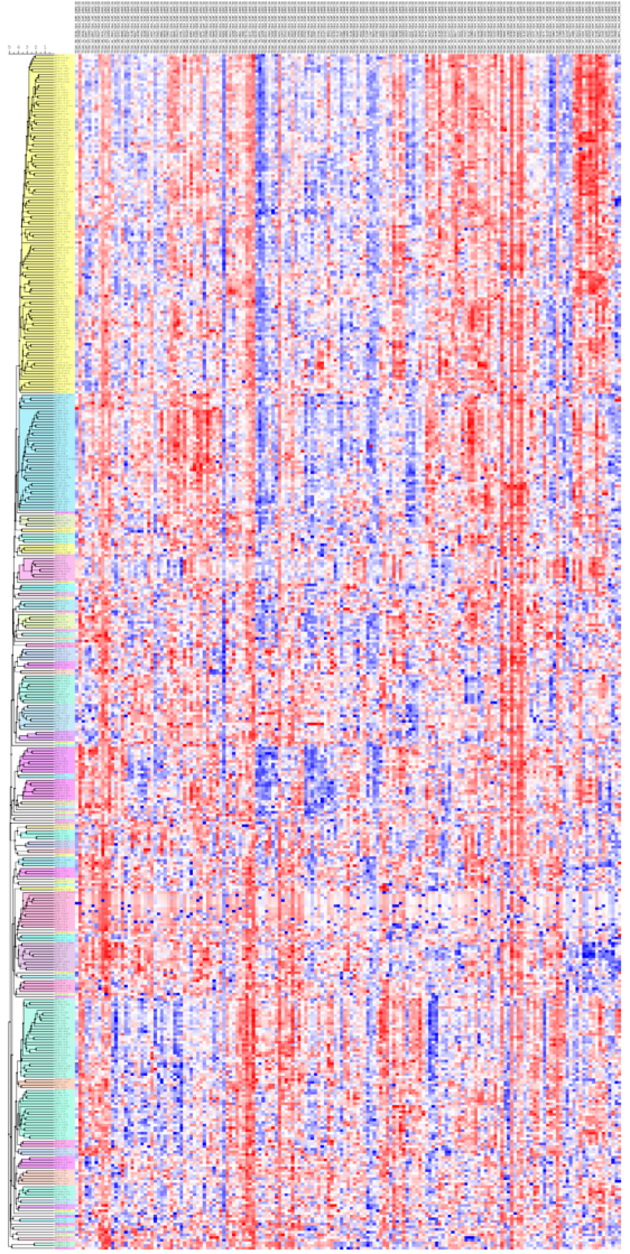
[ Heatmap Example ]
To generate a heatmap:
- Read in a table containing the data.
- Click on the Plot/Histogram button on the side of the table.
- Click on the heatmap tab at the top.
- Add the data sources you want in the heatmap based on the column headers in the table.
- Check how you want to label the rows.
- Edit the color gradient if necessary.
- Click OK.
- Read in table d.tsv from here: https://molsoft.com/addons/ftp/workshop (1. cut and paste the address into a web browser. 2. Right click on d.tsv and choose "Save Link As". 3. Open the .icb in ICM File/Open).
- Select numerical columns by clicking on the column header and holding CTRL key.
- Right click on the column header and choose "Reorder by Clustering".
- Click on the cluster button on the right hand side of the table and use the default options.
- Right click in the cluster and "Change Record Labels"
- Check color check box and click 'Add All Numerical'
- Remove cluster related columns from the end ('cl' 'ord', etc ...)
- Click OK a tree and heatmap as shown below will be displayed.
- CTRL +/- allows you to zoon in and out.
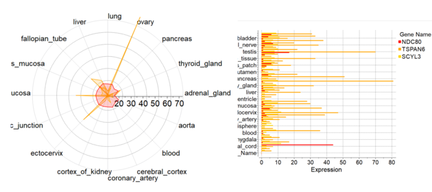
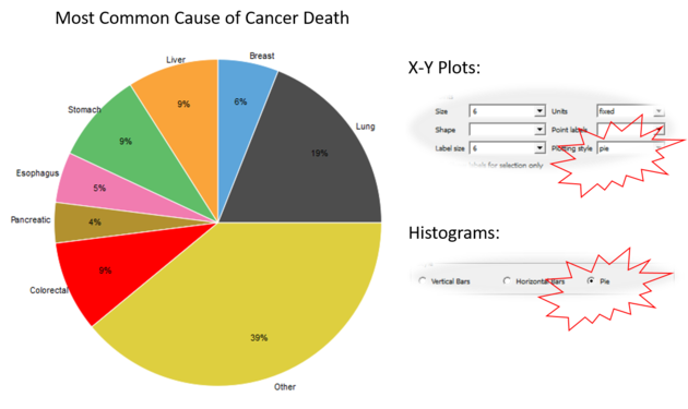
To generate a Pie Chart:
- Read in a table containing the data.
- Click on the Plot/Histogram button on the side of the table or right click choose Options on a plot.
- For Histogram choose Plotting Style > Pie radio bin. Number of bins/sectors can be controlled the through the 'Bin Size' parameter. For Plots choose Points > Plotting Style > Pie 'X' should be discrete (integer or string column with categories), 'Y' - any numerical column.
To add a title to a plot:
- Right click on the plot and select Edit Title or choose Options
Each axis has a set of options which can be accessed by right clicking on the axis and selecting Options.
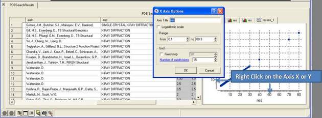
To change the title of the X or Y Axis:
- Right click on the axis and select options
To change the data range:
- Right click on the axis and select options
- Change the From and to values in the Range box
To change the Grid steps (ticks) on the X or Y axis:
- Select either a fixed step e.g. 10 and you can define the number of subdivisions (ticks) in each step. Choosing 1 will display zero ticks between divisions.
To change the axis to logarithmic
- Right click on the axis and select options
- Select the Logarithmic scale check box
To swap the X and Y axis:
- Right click on the plot and select Options.
- Select the Swap X and Y button.
- Click OK.
To change the data source for either the X or Y axis:
- Right click on the plot and select Options.
- Select the drop down arrow as shown below and select a different column from the table.
- Click OK.
To change the scale of the axis to logaritmic:
- Right click on the plot and select Options.
- Select the Logarithmic check box.
To change the plot mark, shape, style or label:
- Right click on the plot and select Options.
- Select the desired size and shape using the drop-down buttons in the Marks section of the window.
To add point labels:
- Right click on the plot and select Options.
- Select the drop down arrow in the Point labels dialog box
- If you only want to label selected points check the Show labels for selection only option. Making plot selections is described here.
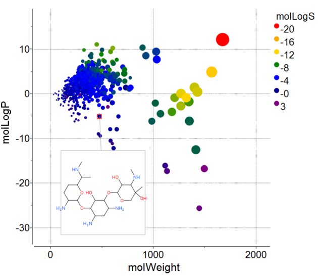
To change the color of the plot marks:
- Right click on the plot and select Options.
- In the Color section of the window select the Source (column name plotted as X or Y) you wish to color.
- Select the color palette and choose the desired color or you can choose a Gradient of colors.
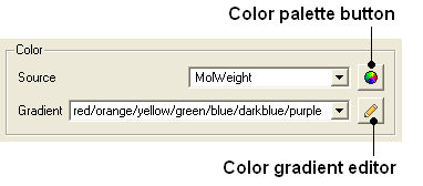
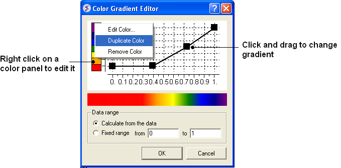
To edit the color gradient
- Click on the Color gradient editor button and a window as shown below will be displayed.
- Click and drag on a mark in the gradient plot to change the color gradient.
- Right click on a color in the Y-axis to - Edit, Duplicate or Remove Color.
- The color gradient can be applied to all points in the data or for a fixed range.
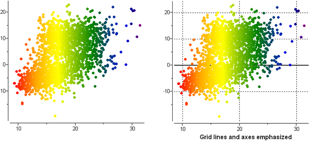
To remove the grid display and/or highlight the axes:
- Right click on the plot and select Options.
- Check the Show grid or Emphasize axes options.
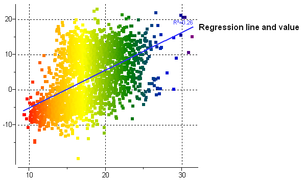
To fit the data to a straight line using least square fitting and report the equation:
- Right click on the plot and select Options.
- Select the check box for Least squares fitting line.
- Choose Linear, Logarithmic or X=Y.
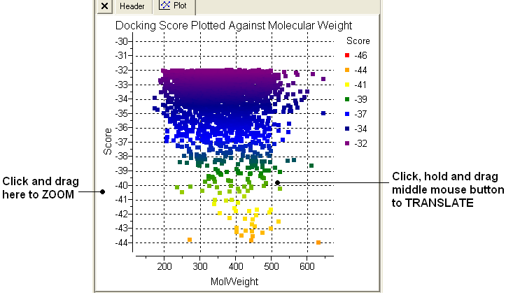
To zoom into a plot:
- Click outside the plot on the left-hand-side and drag the mouse or use the middle mouse wheel to zoom in and out.
To translate a plot
- Click, hold and drag using the middle mouse button on the plot.
To center onto a plot
- Right click on the plot and select Center all or Center Selection. Making selections in a plot is described in the next section.
To center into an axis
- Right click on the axis and select center.
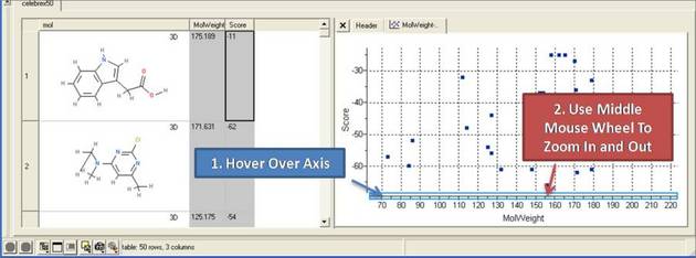
To zoom into an axis
- Hover the mouse over the axis until you see a blue rectangle surrounding the axis.
- User the middle mouse wheel to zoom in and out as shown below.
To make a selection in a plot:
- Click and drag in the plot to make a selection. Individual points can be selected with a single click.
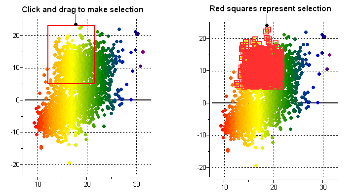
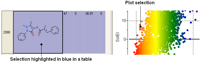
All selections are directly linked to the table from which the plot was made. Selections in the table are highlighted in blue.
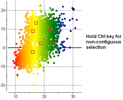
Non-contiguous selections in the plot can be made by holding the CTRL key.
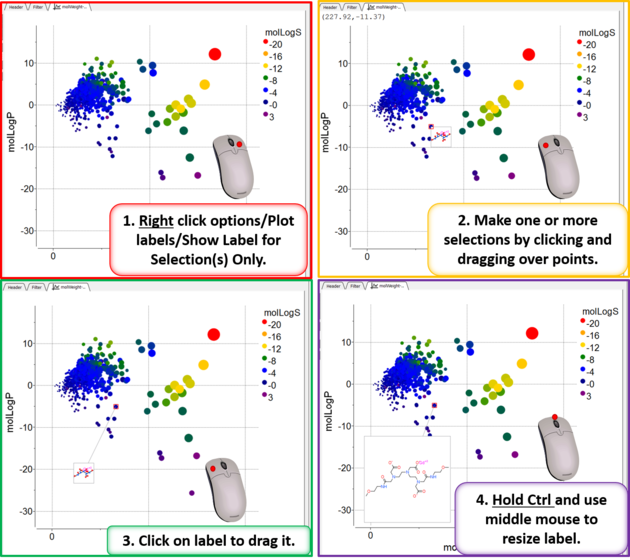
To add a label to one or more points:
- Right click on the plot and choose options.
- Look for the section Points and the dialog box *{Points Labels}
- For this example we will use the drop down button and choose "mol".
- Check the option show label for selection only.
To drag the label:
- Left click on the label and drag.
To make the label display bigger
- Hold the Ctrl key and use the middle mouse button.
To print a plot:
- Right click on the plot and a menu will be displayed.
- Select the print option.
To save a plot image or copy to clipboard:
- Rifht click on the plot and select Options and then check the antialias button. Click Apply and OK.
- Right click on the plot and a menu will be displayed.
- Select the Save/Export Image option.
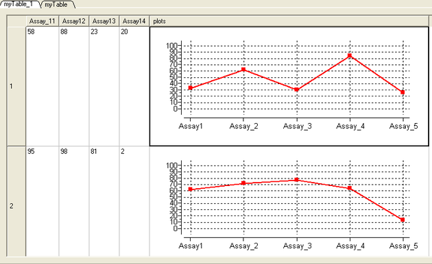
Plots can be inserted into a table row by:
- Select the columns you wish to plot.
- Right click on the column header and select Inline Plots
- The plot will then be displayed in each row of the table.
- Plots can also be displayed in grid view.
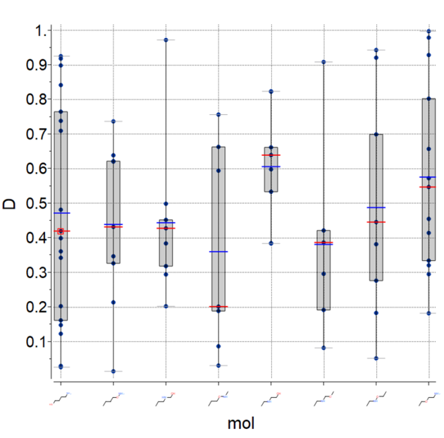
To plot the mean, median and IQR for data:
- Make a plot of X vs Y
- Right click and choose options.
- Select the option: Show Median/Mena/IQR For Y
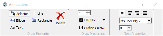
You can add text, lines, rectangles, and ellipse to a plot. To annotate a plot:
- Right click on a plot and select Annotate.
- Select the draw element and then click on the plot.
- Change the draw element properties if needed (e.g. font size).
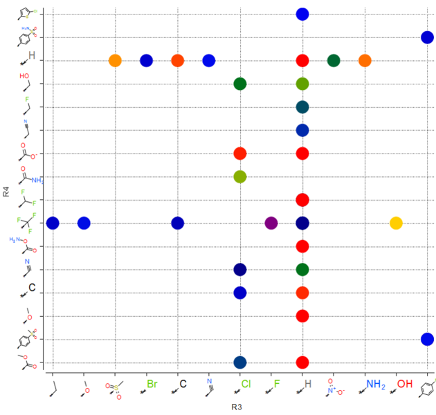
To plot R-groups e.g. from the results table of library decomposition.
- Click on the plot button on the side of the chemical spreadsheet.
- Select the R-group column for the X and Y axis.
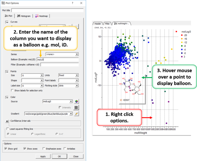
When you hover over a point in a plot it is sometimes useful to be able to visualize some data regarding that plot. You can do this by setting a balloon.
- Right click on the plot and select Options.
- Enter the name of the columns containing the data you wish to display in the balloon (e.g. mol, ID).
- Hover over a point in the plot and the balloon will be displayed.